
 |
| Ode to Kodachrome |
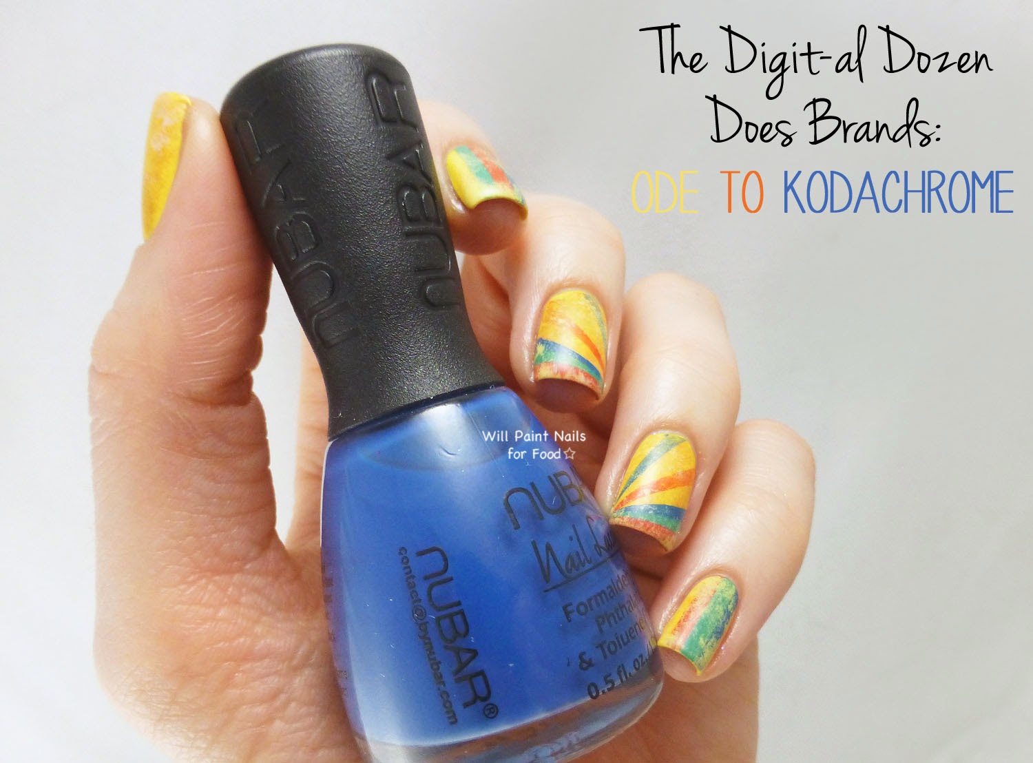
About this design: I remember several years ago hearing about the end of Kodachrome. For those of you who aren't familiar with the film, it had kind of a cult following by experts and amateurs (and even a song named after it). But the film requires special equipment to process it. So it's not something you can take to any photo lab, and it's also not something you could develop at an at-home studio.
 |
| Ode to Kodachrome |
Because of declining sales, Kodak stopped producing Kodachrome in 2009, and the last roll of film was developed in 2010. Even if you had an old roll of Kodachrome you would not be able to get it developed because there's no where in the world that has the equipment to do it. Why am I telling you all of this? Well I think it's kind of sad - yes, we have all this digital technology, but whenever I see a photo taken with Kodachrome it has this quality that is enigmatic. It's like the kind of look that we try to emulate through filters and apps like Instagram and Line Camera, but they never come close.
 |
| Ode to Kodachrome |
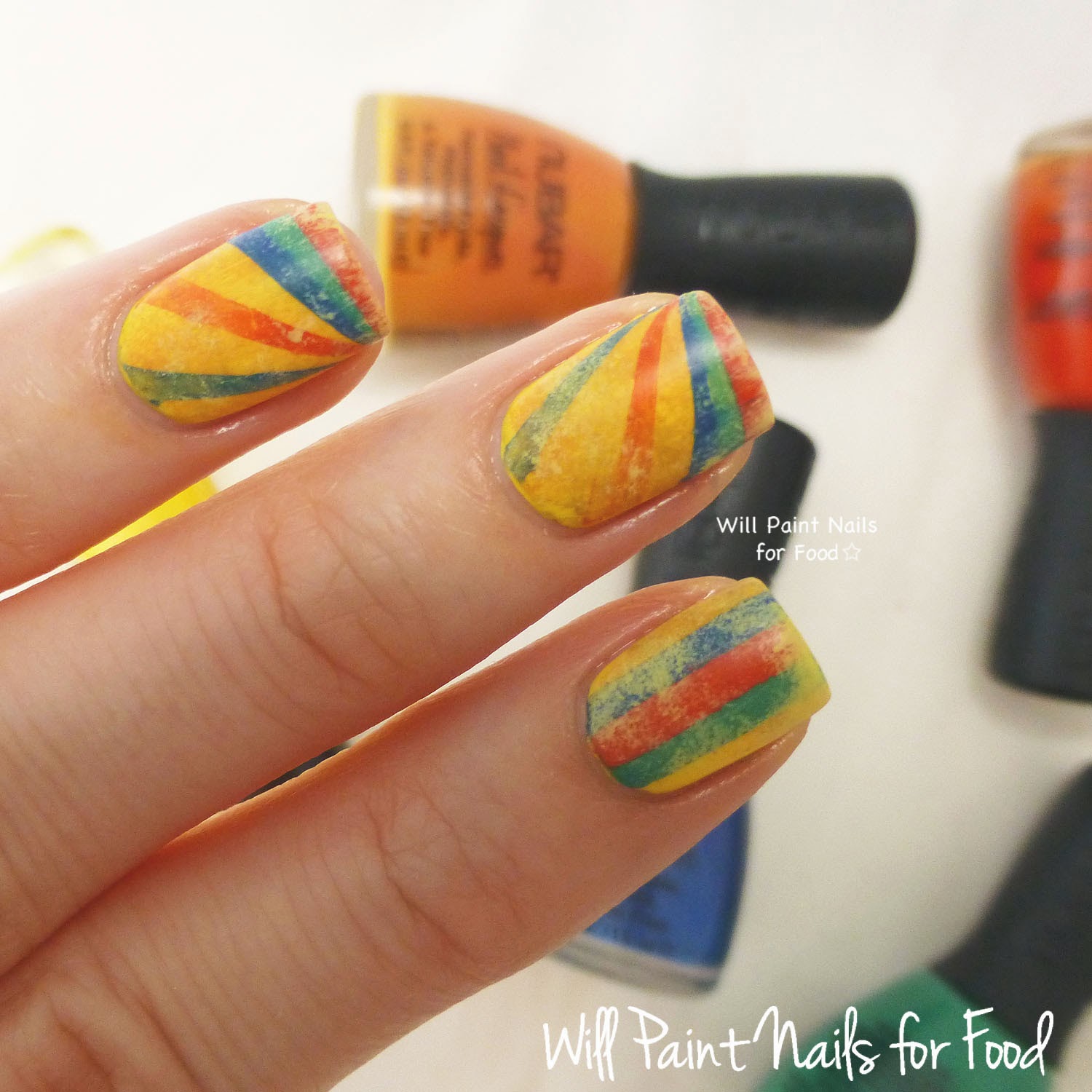
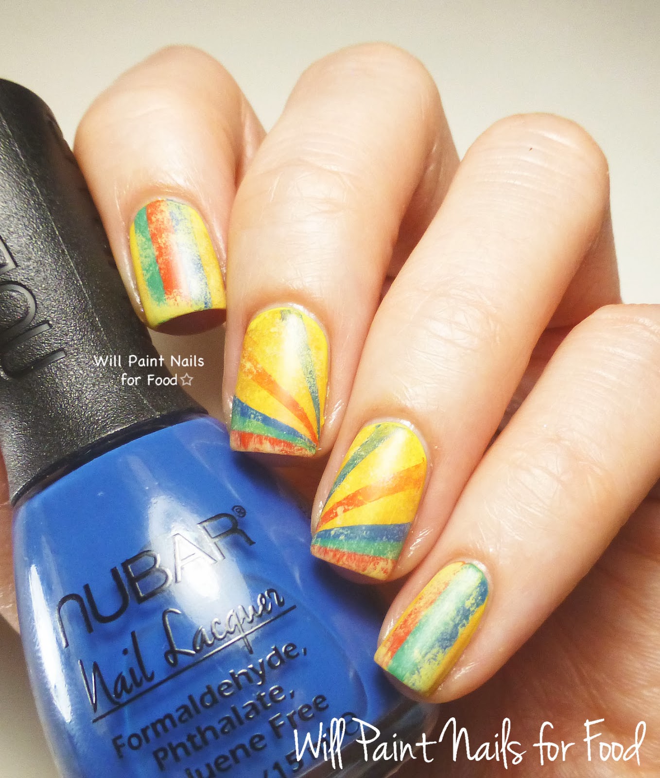
So this design was taken from the old packaging of Kodachrome film. I knew the moment I saw it that I had to recreate the design!
 |
| Source |
To get this look: You may or may not know from reading this blog that I really dislike tape manis. I call it the "distaste for tape." Too much taping results in what I call "tape rage." So when I decided to do this design, my reaction was a mix of "that could look really awesome" and "crap, that's going to require tape."
 |
| Ode to Kodachrome |
I started with a base of Sally Hansen Lightening, a yellow creme. I then sponged on very lightly, Nubar Forbidden Fruit (orange) and Cult Nails Fetish (black thinned down so that it was very, very faint). This gave me a background that had a distressed, vintage look. I topped that with a quick dry clear coat.
Then on to the taping. Using striping tape I painted my stripes (pinky and index) and rays (ring and middle) with Nubar Into the Wild (green), Nubar On the Radar (red), and Nubar Dusk Till Dawn (blue). I just made sure to be very careful when placing the tape, also to not place tape over any areas still wet.
 |
| Ode to Kodachrome |
The final step was the faded/vintage effect. I mixed OPI My Vampire is Buff with Lightening to get a very, very light yellow. I sponged this on making sure that my sponge had barely any polish on it - dab on a paper towel first to remove as much polish as you can. Once I had a look I was happy with, I topped it with a clear coat then finished with Cult Nails Wax That.
 |
| Ode to Kodachrome |
Overall: These are not colours I gravitate to at all, yet I have so much love for this look. I think it's the faded/distressed look. I'm also proud of myself for doing all this taping, and I'm happy to report that no "tape rage" occurred in the making of this mani. I'm thinking of doing another faded/vintage logo design this week. But we'll see if it pans out.
What do you think of this? And thanks for reading!
See also:
Day One: Pretty Little Bottles
---
Absolutely amazing <3 I'm not a fan of tape either but I'm using it from time to time (like once or twice a year lol)
ReplyDeleteThese look great! I love how it has kind of olden day feel to it.
ReplyDeleteThis design is so awesome!
ReplyDeleteThese are so cool, love the design!
ReplyDeleteOh WOW! I absolutely love that gorgeous vintage look! A very cute design with inspiration from the little box and all. That vintage technique is really something I will keep in mind! Love it!
ReplyDeleteThe mani itself is gorgeous and I love your inspiration!
ReplyDeleteThis is really, really great. I love it!
ReplyDeleteSo beautiful! You've really nailed that old vintage look :)
ReplyDeleteAbsolutely adore this, at first I thought maybe you had used a buffing block to get the distressed look. Incredible work, Love it!
ReplyDeleteThis is incredible, I love it so much. Having read your explanation as to how you did it, it makes perfect sense now, but when I first saw the pictures I couldn't figure it out. I was just in awe. You completely nailed it, it's so great!
ReplyDeleteSo fantastic, Meghan!! I love these. I'm always so impressed by your ability to make things look antiqued yet fresh. :)
ReplyDeletethis is a beautiful thing right here. this absolute art at distressing really takes the current "grunge" look to a whole new art form!
ReplyDeleteThis is absolutely stunning!
ReplyDeleteThese are just outstanding! Gorgeous! Love the distressing that you did, it's perfect!
ReplyDeleteVery very cool mani! I love the aged effect!
ReplyDeleteI love how you vintage-d it up
ReplyDeleteThis is seriously one of the coolest manicures I have ever seen, I love it so much! You recreated that vintage effect so perfectly!
ReplyDeleteThese are ABSOLUTELY STUNNING! I can't wait to try out a vintage design inspired by this post since you so eloquently described how to get the effect :)
ReplyDeleteTo get this look: You may or may not know from reading this blog that I really dislike tape manis. I call it the "distaste for tape." Too much taping results in what I call "tape rage." So when I decided to do this design, my reaction was a mix of "that could look really awesome" and "crap, that's going to require tape."
ReplyDeleteOMG this is so me it's ridiculous! I hate tape and I say it in every chance I get lol and the mani is epic btw! I might try it some time!